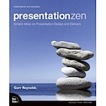
All hail Garr Reynolds! He has written the definitive book about making great presentations: Presentation Zen: Simple Ideas on Presentation Design and Delivery (Voices That Matter). To give you a taste of his book (and increase my link count), here are ten questions (really thirteen) with Garr.
- Question: Who indexed your book? I know I’m in it, but I’m not in the index . Of course, it does say something about me that I would look for my name in the index. :-)
Answer: I was horrified when I saw that! A thousand apologies. I since learned a good piece of advice for new authors: Always do your own indexing or at least be very involved in it. The indexer did a very good and quick job, so it was my fault for not checking and adding a few names and page numbers to subjects. The index was designed to be light to save space, but not that light. Live and learn.
- Question: Okay, now that we got that out of the way, what is the “Presentation Zen” approach?
Answer: Presentation Zen is indeed an approach not a method. There are many paths and many methods to presenting insanely well today. At its heart Presentation Zen is about restraint, simplicity, and a natural approach to presentations that is appropriate for an age in which design-thinking, storytelling, and “right-brain thinking” are crucial complements to analysis, logic, and argument.
The goal of the book was not to offer panaceas and rigid rules, but instead to encourage people to think differently about their visuals, the way they present them, and how they connect with audiences. My hope is that people find some things new in the book that stimulate their creativity–helping them to discover a more “enlightened” and more effective approach to presenting.
- Question: How did we get to this place where most presentations suck?
Answer: There are many reasons. First of all, presenting exceptionally well isn’t easy. In fact it’s hard. That’s why we find great presenters—and great communicators in general—so remarkable. They are all too rare. Many professionals simply have never had much practice and just follow conventional wisdom and do it “like everyone else” instead of doing it effectively.
PowerPoint and Keynote are both pretty simple tools, but there has been too much focus on the tools themselves. If people want to learn how to make better slides they should study good books on graphic design and visual communication to improve their visual literacy.
When it comes to designing appropriate visuals, there is a hole in our education. Concerning quantitative displays, for example, very few people have had proper training in how to design graphs and charts, etc. The great master Edward Tufte has written many useful books in this regard.
- Question: Are PowerPoint and Keynote part of the problem or part of the solution?
Answer: There is no question that PowerPoint has been at least a part of the problem because it has affected a generation. It should have come with a warning label and a good set of design instructions back in the ’90s. But it is also a copout to blame PowerPoint—it’s just software, not a method.
True, the templates and wizards of the past probably took most of us—who didn’t know any better anyway—down a road to “really bad PowerPoint” as Seth Godin calls it. But today we know better, and we can make effective presentations with even older versions of PowerPoint—often by ignoring most of the features. Ultimately it comes down to us and our skills and our content. Each case is different, and some of the best presentations include not a single slide. In the end it is about knowing your material deeply and designing visuals that augment and amplify your spoken message.
- Question: In a nutshell, what makes a good presentations stick?
Answer: If you want to know how to make better presentations, buy Made to Stick
by Chip Heath and Dan Heath. The Heath brothers found that sticky, compelling, and memorable messages and ideas share six common attributes: Simplicity, Unexpectedness, Concreteness, Credibility, Emotions, and Stories. Ask yourself how your presentations rate for these elements, and you are on your way to crafting presentations that stick.
- Question: Specifically, what makes Steve Jobs’s presentations so great?
Answer: Steve Jobs makes it look easy. He’s comfortable and relaxed. This in turn makes the audience feel relaxed. His keynotes usually rate very high on the Heath brothers’ “sticky scale” above. Steve also speaks in a manner that is conversational, and even though he practices a lot before the event, his words never sound scripted.
Steve uses the slides to help him tell a story, and he interacts with them in a natural way, rarely turning his back on the audience because monitors in front show the same onscreen image as well as the next slide. Steve uses visuals, his own words, and a natural presence to tell his story. His visuals do not overpower him, but they are an important component of the talk. Steve also demos his own software. This is much harder than giving a presentation, but he pulls it off well. How many CEOs can do that?
- Question: Do you think that Bill Gates (a) knows his presentations are lousy and doesn’t care or (b) doesn’t know they are lousy at all?
Answer: Who knows? Historically, Bill has been a good contrast in styles to Steve Jobs. In the past we said, “Do it more like Steve and less like Bill.” The thing is, one-on-one Bill seems very engaging and very likable, but he has always struggled with the keynote address. The awful slides behind him usually do not help.
I wish Microsoft would call Bert Decker for some coaching and hire Duarte for the visuals. If Duarte can make Al Gore an extraordinary presenter, think what they could do for Bill. Bill is a remarkable man, not just for his software so much as for his philanthropy and his work with his foundation. So it would be nice for a remarkable man like Bill to be a remarkable presenter too. His CES keynote was better—not great, but an improvement. Perhaps Bill will abandon the all too common common “death by PowerPoint” method in future.
- Question: What’s your version for the optimal number of slides, length of presentation in minutes, and font size?
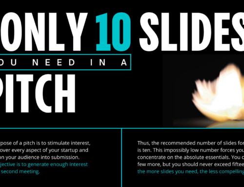
Answer: It really depends on a great many things, but if I was going to make a pitch to a venture capitalist, I’d probably recommend your 10/20/30 method. That is, the presentation should have about ten slides, last no more than twenty minutes, and contain no font smaller than about thirty points. I especially like the twenty-minute limitation of this method.
There are myriad types of presentation situations and the actual number of slides and the time may vary greatly depending on the specific circumstances and method. However, the audience should have no idea how many slides you have. Once they start counting slides all is lost. As far as text goes, I say as little as possible on slides, but when text does appear it should be large and serve to complement your words. People did not come to read; they came to hear. Any speaker can read bullet points. The audience wants to hear your story not read it.
- Question: How many slide transitions should a presentation contain?
Answer: It’s good that PowerPoint and Keynote have many transition options, but people need to exercise restraint and use a very few effects. I suggest using no more than two to three different types of transition effects per presentation and not use transition effects for every slide. I use a fade to black between the major sections of a talk to communicate closure of one section and the opening of the next one.
I often use a smooth dissolve to gently move from one visual to the next as I continue speaking. Using no transition effects is also often appropriate. When you watch a film or a TV show you are not usually aware of the transition effects from one scene to another–that would be distracting. Audiences should not notice the effects we employ between slides too.
- Question: Why do you think 2-D graphs are better than 3-D graphs?
Answer: 3D charts and graphs are very popular with consumers, but in almost every case it is preferable to use 2-D graphics to display 2-D data. Charts with 3-D depth and distortion usually make things harder to see, not easier. Some of the precision is lost. There is beauty in the simple display of the data itself, there is no need to decorate with distorted perspectives. If the graphic is just for showing the roughest of general trends, then there is nothing really wrong with a 3-D chart I suppose, but when you are trying to show a true visual representation of the data in the clearest way possible, a simple chart without 3-D adornment is usually better.
- Question: How many times do you think a person should rehearse a presentation?
Answer: You should rehearse at least three to four times all the way through and rehearse the first three minutes at least ten times or more. You also need to do a formal dress rehearsal in front of a real audience such as coworkers who can give you constructive criticism.
In some ways good presenting is like good writing, you’ve got to pare it down and dump the superfluous and the non-essential. But since we are so close to the material it is hard for us to see what works and what does not, or what is repetitive, etc. This is why you cannot only rehearse alone. You’ve got to rehearse in front of others so that you can experience the nerves, the blank stares, etc.
The more you rehearse the more the fear of the unknown is removed. The more the fear is removed, the more confident you will become. As you become more confident you will feel more relaxed and your confidence will shine through. The thing about confidence is that it’s impossible to fake, but with practice you will indeed become a confident speaker. And yes, it is possible to rehearse too much. You want it to sound natural and fresh, not mechancial and memorized. Usually three to four full rehearsals will get you there.
- Question: What is the single most important thing people could do to enhance their presentations?
Answer: Turn off the computer, grab some paper and a pencil, and find someplace quiet. Think of the audience. What is it they need? What is it you want to say that they need to hear. Identify what’s important and what is not. You can’t say everything in a twenty-minute talk—or even a two-hour talk.
The problem with most presentations is that people try to include too much. You can go deep or you can go wide, but you can’t really do both. What is the core message? This time “off the grid” with paper and pencil or a white board is where you can clarify your ideas and then get them on paper visually. After your ideas and basic structure are clear, then you can open up the software and start laying out the story in the slide sorter view.
If the computer ever freezes in your live talk you need to move on. The work you did in the preparation stage “off the grid” and away from the computer will help make things concrete in your own mind so that you can move forward sans your Macintosh in the event of a technical glitch. By the way, if you ask the audience to bear with you as you try to make the computer work, you might as well stick a fork in it because you are done. Keep moving forward in the unlikely event of a technical glitch.
- Question: Who are the ten best presenters?
Answer: I have pointed to many on my site over the years such as Seth Godin, Steve Jobs, you, Al Gore, Lawrence Lessig, Tom Peters, Hans Rosling, and many more. Recently I have come to think that US senator Barack Obama is an amazing speech maker as well. But more than anything, I point people to TED where they can see some really good presentations and speeches by some very smart and creative people who are all trying to change the world in their own way. Each case is different, but really, if you’re not trying to change the world, what is the point of making a presentation?


Zen.
For the people who have discovered neither Guy Kawasakis nor Garr Reynolds blog not only can you do both now but read an interview from one to the other. Garr Reynolds has blogged faithfully about presenting for a long while now and I ha…
Zen.
For the people who have discovered neither Guy Kawasakis nor Garr Reynolds blog not only can you do both now but read an interview from one to the other. Garr Reynolds has blogged faithfully about presenting for a long while now and I ha…
Zen.
For the people who have discovered neither Guy Kawasakis nor Garr Reynolds blog not only can you do both now but read an interview from one to the other. Garr Reynolds has blogged faithfully about presenting for a long while now and I ha…
Get Yourself To Presentation Zen
Do you have a passion for presenting? Are you already feed deep in Blogs like Presentation Zen, Great Public Speaking and Guy Kawasaki’s How To Change The World? Have you read the book Give Your Speech, Change The World by Nick Morgan or Beyond Bullet …
Presentation Zen: Simple Ideas on Presentation Design and Delivery
I suppose that I am the first person in Singapore to get my hands on a copy of the book Presentation Zen by Garr Reynolds. Well, I made an order some weeks back when I heard about it from Guy
Tips on Great Presentations
Most Powerpoint presentations suck. Sorry for the harsh language, but sometimes the truth hurts. So this posting titled “Ten Questions With Garr Reynolds” by Guy Kawasaki on his How To Change The World blog should be considered required reading. The…