
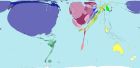
 Check out this web site of world maps that are cartograms (density-equalising maps). The one on the right depicts the level of toy imports. There are ninety-two different maps covering population, imports, exports, tourism–you name it.
Thanks to Jon G for bringing this to my attention. Seeing these maps definitely alters how one looks at the world.
For those of you who missed a previous posting, these are the best charts I’ve ever seen.
Powered by Qumana


Shift Your World View
I’m always struggling to shift my paradigm and un-blur my lens to see the world from a different point of view. Guy points to Worldmapper. This web site presents cartograms or density-equalized maps that are sure to make you think
This is great Guy – I can’t wait to use it with my classes!
I lost interest trying to figure out the colors and sizes of various areas. To me it was not intuitive… would be better if the maps had a clear legend/explanation.
Amazing!
This is great, these are so helpful in looking at the world in a bigger and broader way. Excellent resource for already collected research. Thanks!
They should add this chart type to Microsoft Excel, although they would have to include a complete list of countries.
—————–
chatrobot.net: http://www.chatrobot.net
logview.net: http://www.logview.net
—————–
Worldmapper – a new view of the world.
Thanks to Guy Kawasaki, Apple
Evangelist, for pointing me to Worldmapper.
Worldmapper represents…
ODT
Has some great maps as well.
http://www.odt.org
Including the Population Map (really changed my perspective on things)
http://www.odt.org/Pictures/map%20image%20only%201200.jpg
And
“What is up South”
http://www.odt.org/Pictures/wus_withpanels_800RGB.jpg